Copperplate Calligraphy Font Generator
Tap any card to copy that style.
Copied!
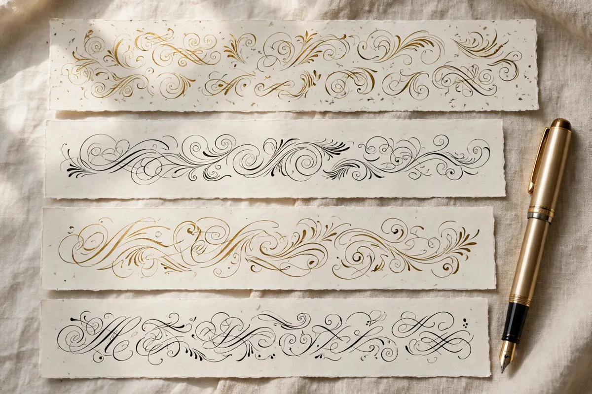
What this tool does
Copperplate is the classic pointed pen script, famous for fine hairlines, shaded downstrokes and exquisite precision. It is the gold standard for formal invitations. Expect delicate, controlled strokes, a consistent slant and beautiful contrast between thin and thick lines. This free tool lets you type any word or short phrase and instantly see it in copperplate style, ready to copy and paste into your design. Try it first with Mr. and Mrs. Bennett and then with your own name, so you can compare how long words and short words behave in copperplate lettering before you choose a final version for print or posting.
How to use it
Type your words into the box at the top of this page, for example Mr. and Mrs. Bennett. Choose a copperplate style preview that you like, then copy the result and paste it wherever you need it. No sign up, download or design skill is required, and you can try as many phrases as you like until the wording feels right.
Best fonts for this
Two fonts from our library pair especially well with this style. Dynalight works well because its light, decorative script suits refined invitations. Parisienne is another strong match, since its light, airy curves feel romantic without looking heavy. Try both with your own words, such as You Are Cordially Invited, and see which one suits your project. As always, check the license note on each font page before commercial use.
Where it works
This style works beautifully for formal wedding invitations and envelopes, certificates, awards and place cards and luxury stationery and heritage branding. For inspiration across every style, browse the A to Z collection, and start new projects from the homepage. You can also explore Italic and Monoline for related looks that pair well with copperplate lettering. If you are new to styled text, read calligraphy alphabet practice via calligraphy alphabet practice for a simple walkthrough. Because this style is best for short lines, use it for the headline and keep directions, prices and contact details in plain text, so every reader can find the practical information quickly.
Tips for better results
Use copperplate for names and short lines, where its detail shines. Print at a generous size so the hairlines do not disappear. Pair it with plain, elegant text for addresses and details. Always preview your final design on the device or paper where people will actually see it, since size and colour can change how lettering feels. Also save a plain text copy of your wording alongside the styled version, so you can reuse names, dates and addresses without retyping them, and keep a consistent style across invitations, posts and packaging.
Frequently asked questions
Q: What makes copperplate special?
Its extreme contrast between hairline upstrokes and shaded downstrokes, created with a pointed pen, gives it unmatched refinement.
Q: Is copperplate hard to read?
In short, well sized lines it reads beautifully. Very small sizes can lose the fine hairlines.
Q: Can copperplate be used online?
Yes, for digital invitations, headers and social announcements, especially at larger display sizes.
Browse all 200 calligraphy tools by style, occasion, platform and theme.